Project 4

25% Growth in Checkout Completion

FinTech

Loyalty system increased store retention by 50% and revenue by 25%

Boosting Conversion Rates for E-commerce Checkout
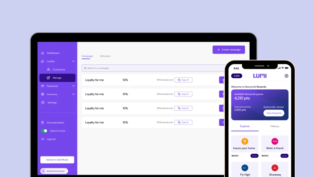
[Project Overview]

Faced with small businesses struggling to retain their customers and track their purchase history and pattern, I worked on the development of a tailored loyalty SaaS platform at Lumi Business. Our solution provides an intuitive, easy-to-use interface that empowers small business owners to create, customize, and manage their loyalty campaigns seamlessly, boosting customer retention and driving growth without the technical headaches.

[Problem Statement]

The platform struggled with a 40% cart abandonment rate during checkout. Users encountered unclear error messages, redundant fields, and poor mobile optimization.

[Industry]

FinTech

[My Role]

Product Manager

[Platforms]

Web & API

[Timeline]

January 2020 - December 2020

[Persona]

Jhon Roberts

Marketing Manager

I just want the checkout to be quick and painless—no surprises or unnecessary steps!

Age: 29

Location: New York City

Tech Proficiency: Moderate

Gender: Male

[Goal]

Quickly complete purchases without interruptions.

Trust the platform to handle her payment securely.

Access a seamless mobile shopping experience.

[Frustrations]

Long or confusing checkout processes.

Error messages that don’t explain the issue.

Poor mobile optimization that slows her down.

[Process]

[01] User Research

Conducted user interviews with 15 participants to understand their frustrations and preferences.

Analyzed user behavior data to pinpoint where users dropped off in the process.

Benchmarked against competitors to identify best practices for checkout flows.

[01] User Research

Conducted user interviews with 15 participants to understand their frustrations and preferences.

Analyzed user behavior data to pinpoint where users dropped off in the process.

Benchmarked against competitors to identify best practices for checkout flows.

[01] User Research

Conducted user interviews with 15 participants to understand their frustrations and preferences.

Analyzed user behavior data to pinpoint where users dropped off in the process.

Benchmarked against competitors to identify best practices for checkout flows.

[02] Insights

Users were frustrated by unclear error messages and redundant form fields.

Mobile users struggled with small buttons and unresponsive layouts.

Trust the platform with her payment and personal information.

[02] Insights

Users were frustrated by unclear error messages and redundant form fields.

Mobile users struggled with small buttons and unresponsive layouts.

Trust the platform with her payment and personal information.

[02] Insights

Users were frustrated by unclear error messages and redundant form fields.

Mobile users struggled with small buttons and unresponsive layouts.

Trust the platform with her payment and personal information.

[03 Design Solution]

Simplified the checkout process into three steps: Cart Summary, Payment.

Added features like autofill suggestions and real-time error.

Added features like autofill suggestions and real-time error.

[03 Design Solution]

Simplified the checkout process into three steps: Cart Summary, Payment.

Added features like autofill suggestions and real-time error.

Added features like autofill suggestions and real-time error.

[03 Design Solution]

Simplified the checkout process into three steps: Cart Summary, Payment.

Added features like autofill suggestions and real-time error.

Added features like autofill suggestions and real-time error.

[04] Testing & Iteration

Conducted A/B testing with 500 users, comparing the original and redesigned flows.

Gathered feedback through usability testing and refined the design based on user input.

Designed a mobile-first layout with larger touch-friendly buttons and simplified navigation.

[04] Testing & Iteration

Conducted A/B testing with 500 users, comparing the original and redesigned flows.

Gathered feedback through usability testing and refined the design based on user input.

Designed a mobile-first layout with larger touch-friendly buttons and simplified navigation.

[04] Testing & Iteration

Conducted A/B testing with 500 users, comparing the original and redesigned flows.

Gathered feedback through usability testing and refined the design based on user input.

Designed a mobile-first layout with larger touch-friendly buttons and simplified navigation.

[Outcome]

25% increase in checkout completion rates.
30% reduction in cart abandonment on mobile devices.
40% improvement in perceived ease of use, as measured by post-launch surveys.

[Key Learnings]

Simplification is key

Users value a quick and easy process, especially on mobile.

Simplification is key

Users value a quick and easy process, especially on mobile.

Simplification is key

Users value a quick and easy process, especially on mobile.

Iterative testing pays off

Regular testing uncovered hidden issues and ensured the design met user needs.

Iterative testing pays off

Regular testing uncovered hidden issues and ensured the design met user needs.

Iterative testing pays off

Regular testing uncovered hidden issues and ensured the design met user needs.

Details matter

Small improvements, like error validation and mobile optimization, had a significant impact.

Details matter

Small improvements, like error validation and mobile optimization, had a significant impact.

Details matter

Small improvements, like error validation and mobile optimization, had a significant impact.

Select this text to see the highlight effect

Create a free website with Framer, the website builder loved by startups, designers and agencies.